Plot Gallery
Examples of the outputs from Plotting Functions implemented in the toolbox.

histogram() - Draw a histogram, optionally segmented by a second parameter.

plotBatchAndROCorrection() - Visualise the run-order and batch correction applied to a dataset.

plotTIC() - Visualise TIC for all or a subset of features in an MSDataset, coloured by class, dilution value, or detector voltage.
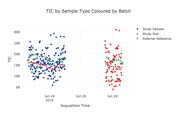
plotTICinteractive() - Interactively visualise TIC vs. run-order for features in an MSDataset, coloured by sample type.
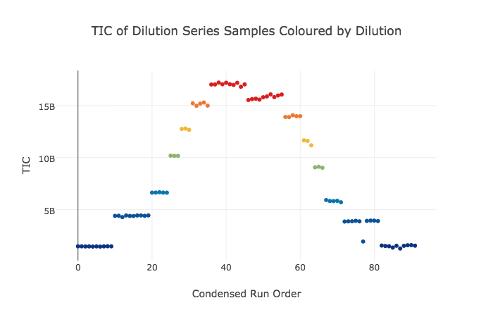
plotTICinteractive() - Interactively visualise TIC vs. run-order of linearity reference samples from an MSDataset, coloured by dilution value.

plotLRTIC() - Visualise TIC vs. run-order of linearity reference samples from an MSDataset, coloured by dilution value.

jointplotRSDvCorrelation() - Visualise 2D histogram of feature RSDs vs. correlations to dilution, with marginal histograms from Spectral datasets.

plotIonMap() - Visualise the features present in an MSDataset object in terms of the original analytics. Also has a plotly-based interactive version plotIonMapInteractive().

plotRSDs() - Visualise the analytical and biological variance in Discretely sampled datasets.

plotScree() - Plot a barchart of variance explained (R2) and predicted (Q2) (if available) for each PCA component derived from a PCA model generated on Dataset datasets.

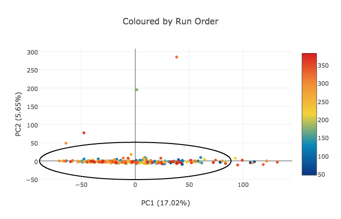
plotScores() - Plot PCA scores for each pair of components in PCAmodel, coloured by values defined in classes, and with Hotelling’s T2 ellipse (95%), derived from a PCA model generated on Dataset datasets.
![Plot scatter plot of PCA outlier stats sumT (strong) or DmodX (moderate), with a line at [25, 50, 75, 95, 99] quantiles](_images/plotOutliers.svg)
plotOutliers() - Plot scatter plot of PCA outlier stats sumT (strong) or DmodX (moderate), with a line at [25, 50, 75, 95, 99] quantiles, derived from a PCA model generated on Dataset datasets.

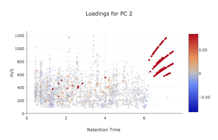
plotLoadings() - Plot PCA loadings for each component in PCAmodel. For NMRDataset datasets plots the median spectrum coloured by the loading. For MSDataset datasets plots an ion map (rt vs. mz) coloured by the loading.

plotSpectralVariance() - Plot of median profile with variance across all samples visualised in Spectral datasets. Also has a plotly-based interactive version plotSpectralVarianceInteractive().
plotScoresInteractive() - Interactively visualise PCA scores (coloured by a given sampleMetadata field, and for a given pair of components) with plotly, provides tooltips to allow identification of samples, derived from a PCA model generated on Dataset datasets.
plotLoadingsInteractive() - Interactively visualise PCA loadings (for a given pair of components) with plotly, provides tooltips to allow identification of features., derived from a PCA model generated on Dataset datasets.

plotDiscreteLoadings() - Visualise loadings of a ChemometricsPCA model.